Hello! Time for me to go on a bit of rant again. So far, these little rants have been very successful! With support from the community (and demonstrating this to the SAP SuccessFactors leadership group), we’ve pushed the dial a few times in the right direction (well, I thought it was the right direction anyway!) Although, I’m perhaps not as optimistic about this one… let’s see!
The “Reimagined” Home Page (a naming that is going to get tired very quickly!)
A little while ago (quite some time actually – end of 2020) SAP announced that it was going to retire the existing Fiori Launchpad style homepage and move to a new “reimagined” home page. The reimagined home page had been demo’d during a few SuccessFactors conferences and looked quite exciting. The new home page is pretty cool. The whole concept of having the things that are important to you right now highlighted and brought to the front is a good one. Show me what I need to act on right now! Make me do it quickly!
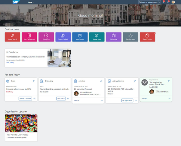
This said – it seems that it’s still a bit of a journey to parity with the old home page. (which may never happen, given the different idea that we’re working with – some things just wouldn’t make sense in a one-to-one mapping.) However, relatively important pieces of functionality, like to-do notifications, manager team tiles and ability to use with onboardees is still being added. There’s also the minor/major issue that you can’t do a refresh to or from any system that has the reimagined home page implemented using the instance refresh tool, you have to request SAP to do it. The plan is that by end of 2H2021 release, everything that is needed to go live with the new home page will be added and these issues fixed. (And hopefully we’ll be able to have that text in the middle of the top panel in some colour other than white).
The (forced) migration to the reimagined home page
There was a plan to push all customers to the new home page by 2H2021. (I just can’t manage to keep typing reimagined… it’s so going to get renamed to “Home Page” as soon as it’s the only option. Can I chalk up another product renaming before it even happens?) But then due to some functionality not going to be available until then, there was this strange idea to push the release universally to all customer’s preview instances 2H2021 and then production 1H2022.
So, I had a bit of a rant about how it really didn’t make sense to push the new home page to all customers’ preview instance before all of the fixes were rolled out and customers had some time to test them. (It wasn’t just me that had this rant – lots of community support for that idea). SAP have now pushed back that idea, we should instead get the universal push in 1H2022 for all customers. So, you’d better get ready for it! Cos it’s coming!
Okay… so what’s the problem?
Well, see the thing is, the main reason that we need the new home page experience, is also the main reason why the existing experience is so useful.

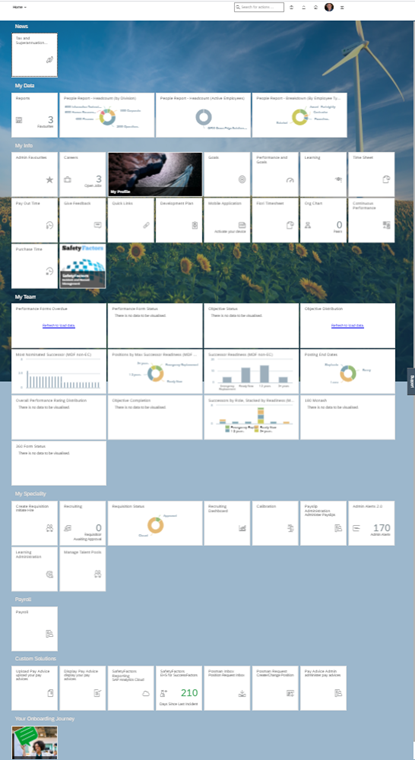
Note how there’s a lot of content on the old layout compared to the new one… well that screen shot is pretty minimalistic compared to some customer instances I’ve come across. (And, I’ll admit, helped implement.)
Here’s a screen shot of one of our demo systems there is a LOT here.
The original idea of the Fiori Launchpad was that a user would be able to see all their important information in one place and drill down to bits that stood out. Of course, that doesn’t work because having pages of stuff means people don’t look at any of it. So the idea of using machine learning to figure out which bits to surface for a person to look at, makes great sense.
The problem is that in many cases SuccessFactors doesn’t know what’s important.
This is especially the case for extension use cases and the “We don’t use just SAP SuccessFactors for all our people processes” use case.
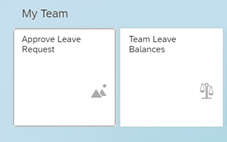
Here’s a couple of examples from one customer I work with:
These two existing home page tiles, “Legacy” I believe the terminology is now, link off to BTP Cloud Portal, which then uses SAP Cloud Connector to tunnel through to an on-premise SAP ECC instance and display Fiori based apps showing leave balances and approval apps that are based on data still stored in SAP Payroll, not in SAP SuccessFactors.
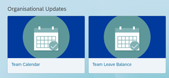
It is exactly the same with these tiles:
The customer also has additional BTP based extension applications – here’s one example:
All managers get the team leave balance tiles/applications and all employees (not contingent workers/contractors) get the leave and payslips apps. And everyone gets the Network Compliance App (it’s really cool btw, if you need something like this, please give me a shout!)
In the new home page these would ideally be part of the leave management quick links or approval tiles that popped up as needed, payslip tiles that appeared when payroll has been sent to bank (dreaming here about next gen payroll, but you get the idea). However, because all these tiles are just links out to other systems/application, they can’t be part of the “intelligent” framework and instead must be part of the “Organisational Updates” section of the homepage. And take up about twice as much screen real-estate. There’s also a limit on the number of tiles that will show in this section, so you’d better hope you don’t have too many custom applications/extensions that you want to link to. (Originally the SAP team had thought to limit the number of “cards” in this section much more, but fortunately a few more are allowed now. (Feedback works!)
Managing Sections with Permissions
So, whilst I would argue that custom cards look really bad in this new experience (they are big, chunky and not sorted into any meaningful categorisation, certainly they are not “Organisational Updates”! – but that’s a topic of a different set of feedback!), we’re only just now getting into the crux of this particular rant, which involves figuring out how to limit who gets which tiles/cards. In the “legacy” home page there is functionality which allows an administrator to create “Sections” on the home page. These sections can then be shown/hidden based upon Role Base Permission (RBP) roles and groups.
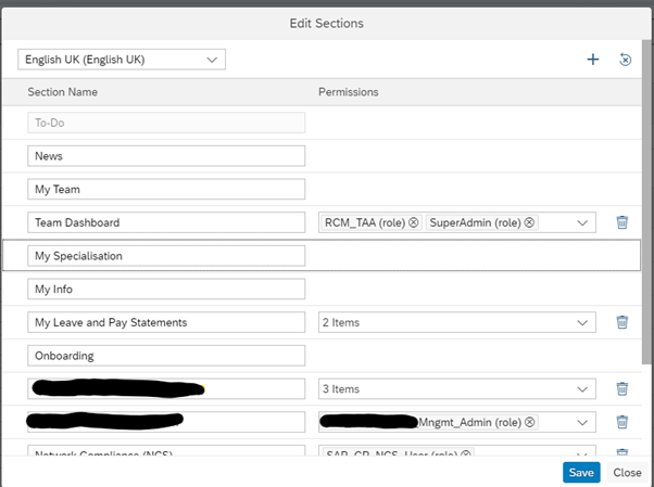
It’s as easy as creating a section and then using the drop down to pick as many roles/groups as you want to allow to see that section.
One particularly useful thing is that you can choose the system generated roles used by compensation, but any role can be used and this can can be one that is assigned to a population of “Managers” for example:

This gives a particularly powerful way to assign access to sections based on system generated subsets of the employee population.
Then we can simply assign whichever tiles we want to whichever sections we want and hey-presto, we have managed to use RBP roles and groups to restrict which users have access to which tiles.
There is the downside that quite often we ended up with a section with only one or two tiles in it, but that wasn’t so bad.
So, again, where’s the problem? Well, the thing is, in the new home page, you can’t do this!
Managing custom tiles with Home Page groups
The solution that has been adopted by the new home page is one that also existed in the legacy home page, but we didn’t use because it’s (my opinion) rubbish. When you create a custom tile you can assign it to a “User Group”.
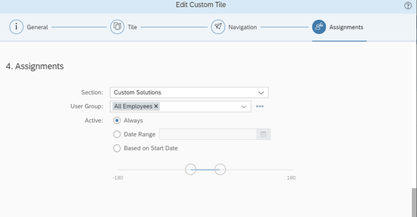
It is possible to edit these user groups:
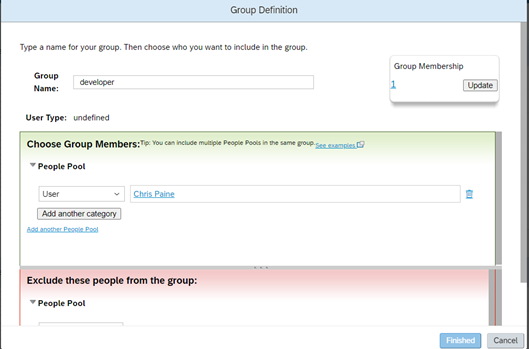
You’ll hopefully be familiar with the layout of the editor as it’s the same one used in managing role-based permission groups.
However, note that you are creating and maintaining “homepage tile groups” and not RBP groups.
There are some serious restrictions here – you cannot make these groups contain all managers for example or any of the other automatically built permission role assignment groups.
If you have an extension application that relies on the end user accessing the application having a certain set of SuccessFactors role-based permissions, then you MUST ensure that any editing of the home page tile group that includes the list of people who can see the custom tile that links to the extension application MUST also update the associated role-based permission group and the two must not get out of sync.
Work Arounds
Well – if you have an extension application that you only want to display to managers as a custom card, well, you’re pretty much stuffed – you cannot use the new home page tooling as it works today. The only way would be to manually maintain the list of all employees that are managers in your organisation. And, ummmm, sorry, this ain’t happening!
I’ve considered building tooling that could automatically maintain these groups based on similar logic to the existing home page, but unfortunately the APIs for dynamic groups are all read only and cannot be used to update a group.
The only things I have so far come up with to enable effective filtering and using custom home page cards are:
- an additional extension application that is launched from the home page and then provides another view of which “additional” applications a user can access. In effect, a secondary launch page which provides the functionality to filter links to applications based on permission roles and groups that the new home page does not.
- An application/integration that regularly goes through all users and updates one of the custom fields to a value which can then be queried by the home page tile dynamic groups (i.e. populate a “is a manager” flag against custom field 14 or something. )
In standard configuration it is still (thankfully) possible to use permission roles and group to decide which items are available in a given user’s navigation menu. Just like the logic that allowed sections to be permissioned in the legacy home page.
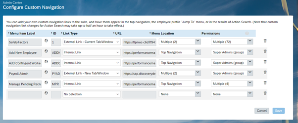
So, it is an option to remove these applications completely from the homepage, and just have them in the custom navigation. For those customers that don’t have a crack extension development team to provide a custom tile that can handle using RBPs to provision or not a secondary launchpad, I think I’d be suggesting that they build a custom tile that explains how to find the now missing links in the user menu.
Plea for support
Okay, hopefully you can see now why I’m really worried about the forced push to the new home page in 1H2022. I have spoken at length with the product team for the reimagined home page and whilst they see the potential issue, my feedback to date has been that they do not envisage fixing this issue before the universal migration to the new experience. They actually encouraged me to write this blog post because they want to see if others believe this to be an issue! I did ask them to just run a query on any existing customer that were using the permissions in existing home page sections, but I haven’t got a response on whether that is a large number or not.
SO… if you’ve read this and thought, “Crap, that could be something that’s going to cause me an issue!” Please, please, get onto the SAP SuccessFactors community web site – post your comments on the Migration to Reimagined Home Page Within 1H 2022 Release – Innovation Alert blog post.
Give me some “Kudos” for my comment on that post about this issue: https://community.successfactors.com/t5/Platform-Resources-Blog/Migration-to-Reimagined-Home-Page-Within-1H-2022-Release/bc-p/268878/highlight/true#M1833 and write about your own concerns. If we have enough customers express to SAP SuccessFactors that this will cause a problem we might just yet, get a solution.
Cheers! Here’s to getting the community involved!


